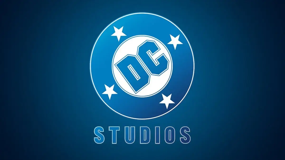
“DC Studios Revives Beloved Vintage Logo”
Classic Pomp with a Corporate Twist: DC Studios Logo Unveiled at Comic-Con
Dry your eyes, DC fans, the San Diego Comic-Con was not completely devoid of DC Studios presence. The stage may have tilted towards Marvel but DC did drop one bombshell. Co-head James Gunn confidently swept off the cover on the all-new attractive DC Studios logo, set to debut with Creature Commandos. Take off those rose-colored glasses, though, because this "brand-new" design is actually pretty vintage. Shocked? Delighted? Let’s dig a little deeper, shall we?
Detective Comics to DC
Rewind to 1934, when DC Comics saw its humble beginnings as National Publications. The company was an amalgamation of National and All-American Comics. One of their early creations, Detective Comics, struck gold, giving the world the dark knight himself, Batman. Paying homage to this success, the heads decided to go by "DC Comics", though it was far from their official title. The DC logo morphed subtly between 1940 and 1970, settling on a rather vanilla, nondescript design. But when the "Man of Steel" bolted into the scene as DC’s poster boy, the logo underwent a makeover to announce "A Superman Publication," sandwiching the DC initials. A nice, toasty logo that eased itself through the Golden and Silver comic book ages.
Identity Crisis and a logo Savior
Ring in the 1970s and DC Comics was grappling with an identity meltdown. Marvel Comics had leaped into the scene and was conquering the comic kingdom, leaving DC in a swirl of dust and antiquity. So, they called in Jack Kirby, a Marvelian, to the rescue. He introduced his Fourth World line of comics, which brought Darkseid into light. Horror and war comics also got a boost. Branding woes led to three different logos between 1970 and 1977. Then, along came publisher Jennete Khan and put a full stop to the logo circus. It was time for an image lift.
DC Renaissance and the Birth of the "DC Bullet"
In the colorful summer of 1977, DC discovered the logo that would reign over the comic covers for the next three decades. Cue Milton Glaser, the artistic genius behind the heart-tugging "I Love NY" logo. Voila, the "DC Bullet" was born. This arrival also sparked a creative surge in the company that turned heads around the world. Tail-end of the ’70s saw this logo gracing favorites like Legion of Super-Heroes and Black Lightning. The true DC rebirth, however, kicked off with the ’80s with the likes of The New Teen Titans and Alan Moore’s Swamp Thing.
Putting the “Comic” in Comic Era
Fast forward to DC’s big 5-oh. We’re talking 1985. Armed with the Crisis on Infinite Earths series, DC saw its universe reshape, with sales laughing all the way to the bank. This golden era birthed some iconic comics including Frank Miller’s Batman: Year One, John Byrne’s Man of Steel, and Grant Morrison’s Doom Patrol. The ’90s and the early 2000s witnessed the DC bullet on every title cover, except when adult titles switched to the Vertigo label.
Rebirth, Renaissance, Redemption
2005 brought a new logo, only to last seven years. As part of the New 52 reboot, DC birthed another logo, the latest popping up in the 2016 Rebirth era. Yet, none could replicate the fame that the DC bullet had acquired. It’s no surprise then, that James Gunn would opt for a logo that exudes the excellence and glory of that era. Hats off, Gunn, there couldn’t be a better choice to reignite the DC Studios’ creative spark.
Read this article and more at August Tales Comics. Your go-to site for trade paperback exchanges and comic book news! Trade. Read. Repat.
#comics #comicbooks #graphicnovel #graphicnovels #augusttales
Image credit: nerdist.com


